The challenge
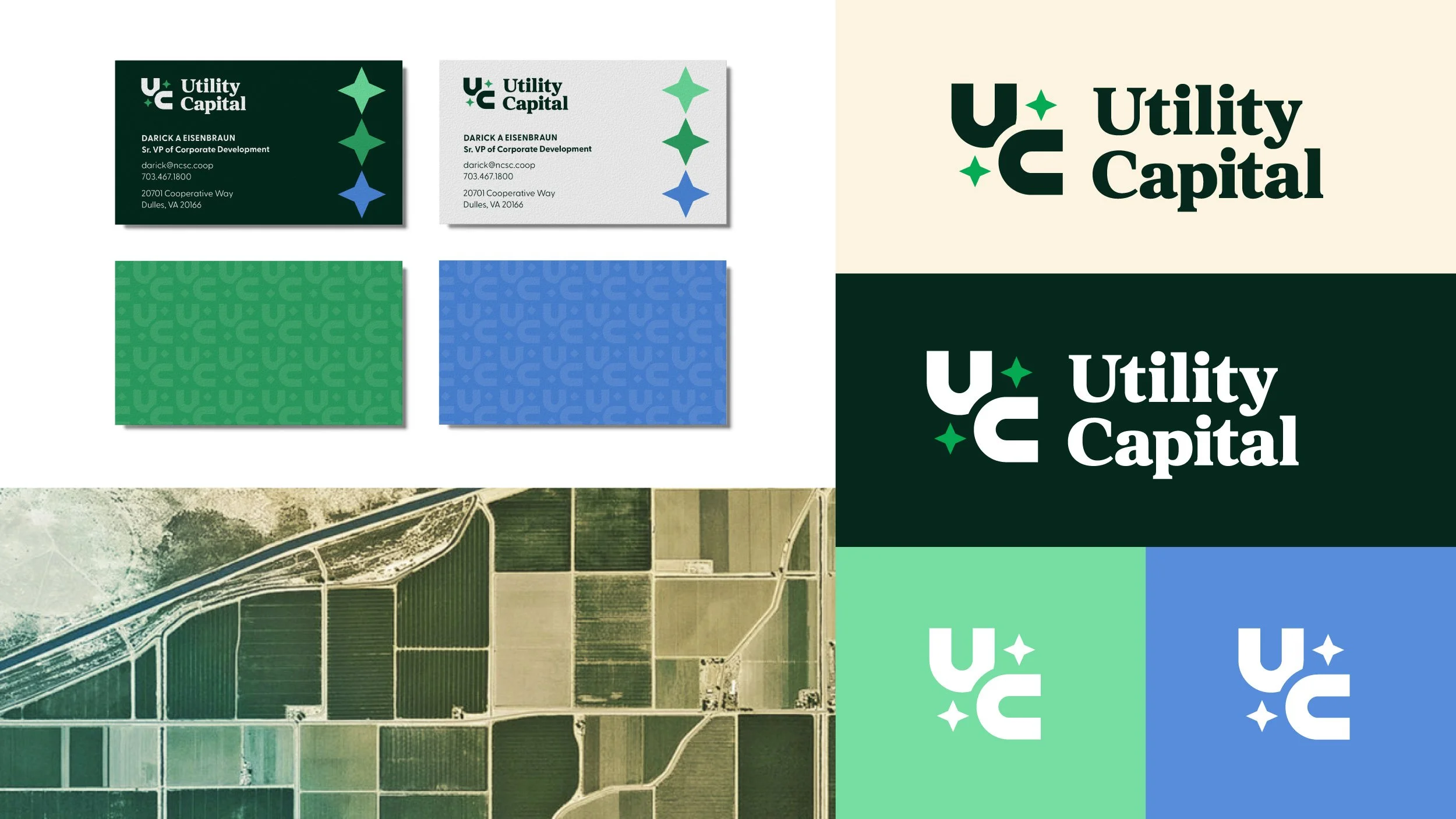
Utility Capital finances rural utility projects across broadband, electric, and telecom—the infrastructure that keeps small communities running. The company had just changed its name and was carrying a dated logo that did nothing for either half of its story. It needed to look like a lender people can trust with serious money, while feeling like a company that exists to serve rural America.
The solution
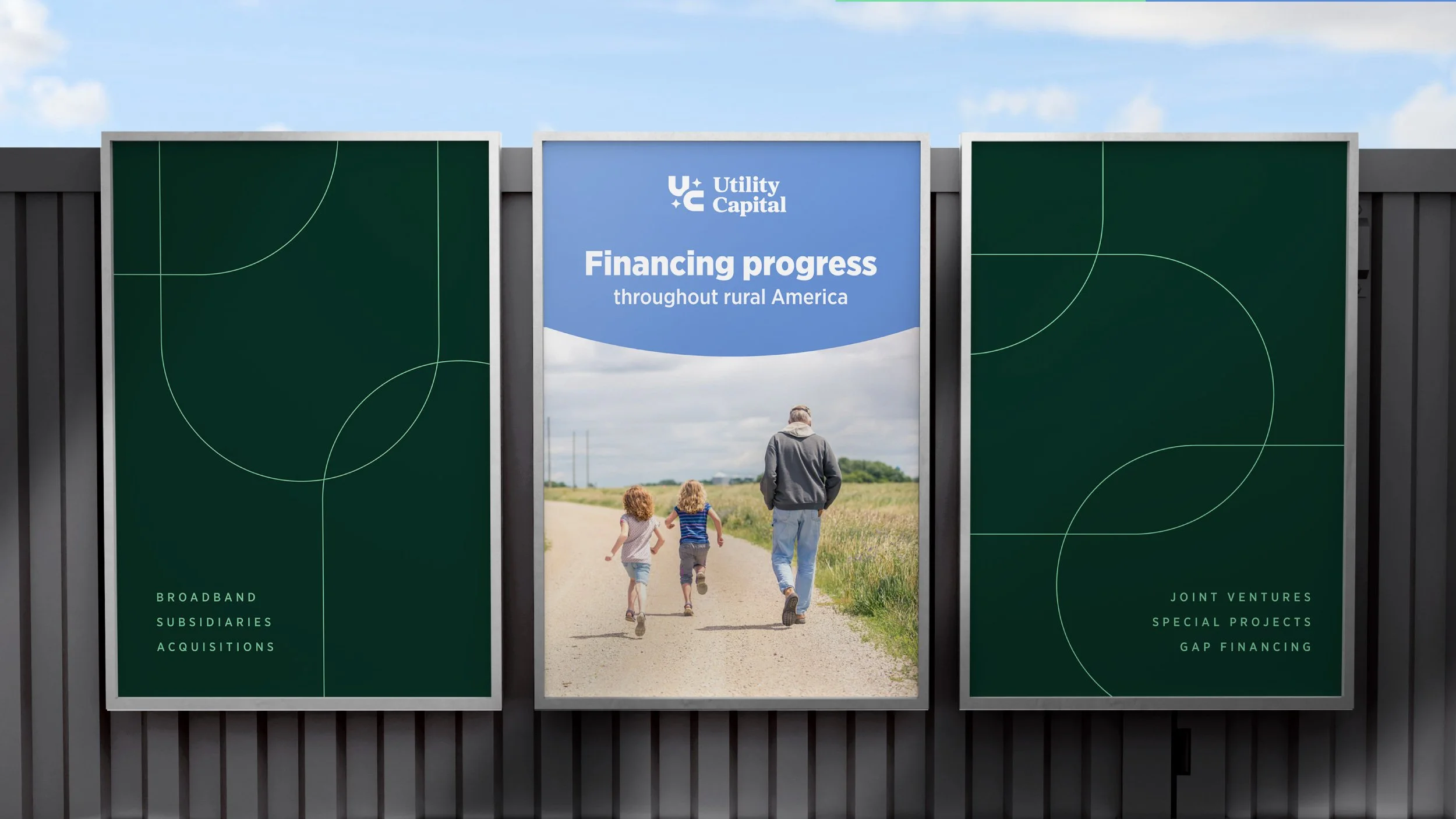
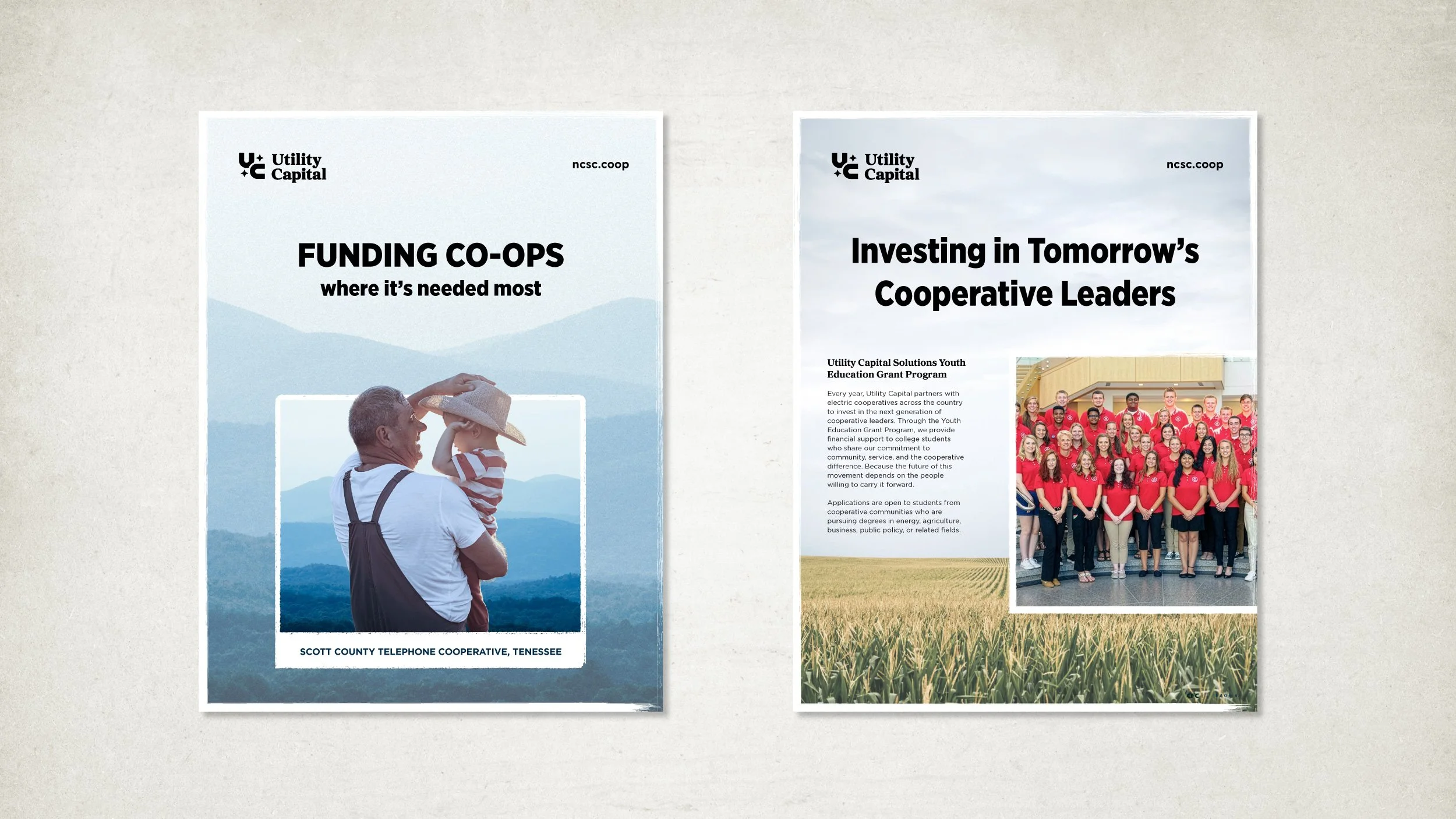
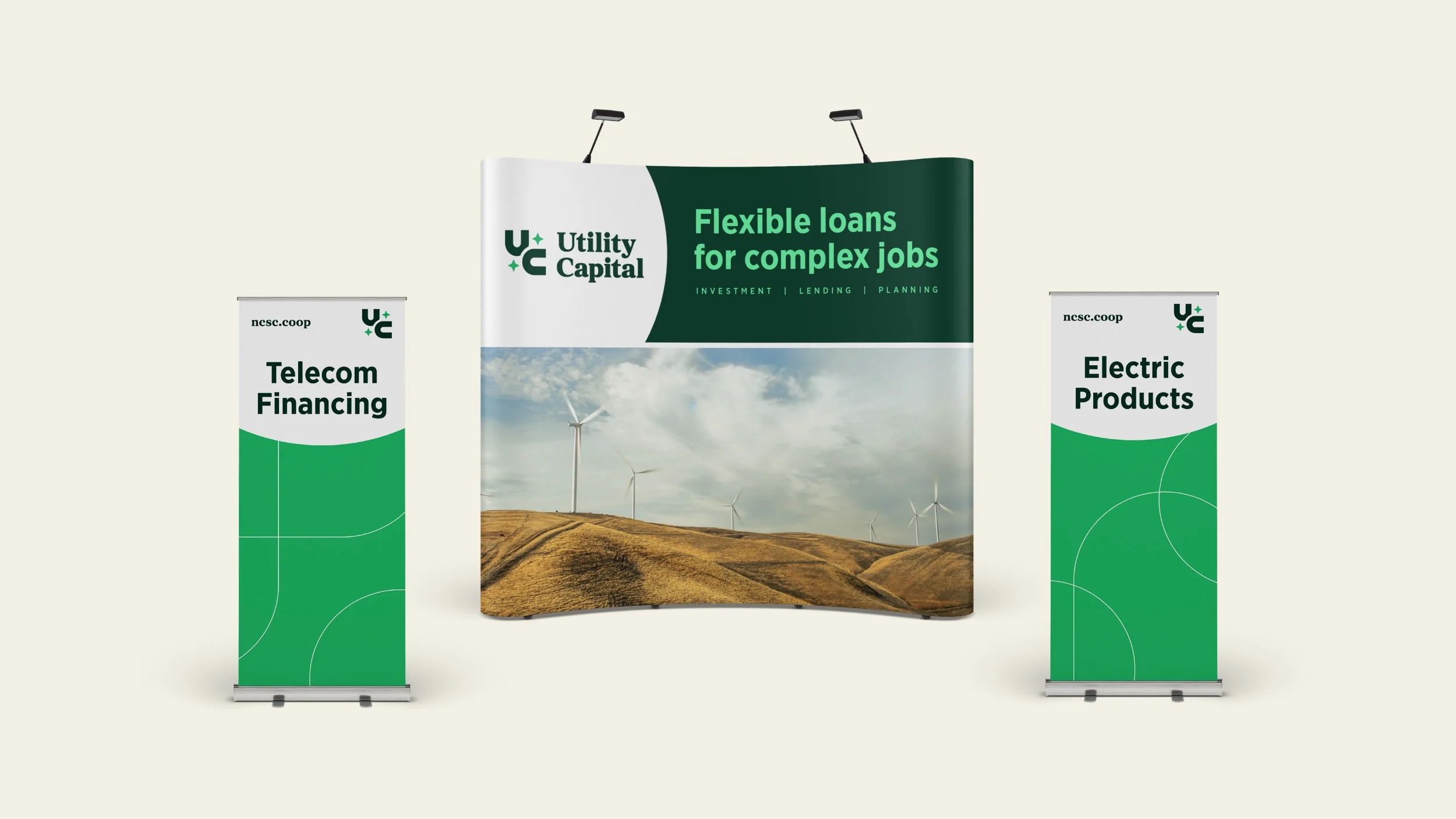
A UC monogram built from soft, rounded letterforms and a friendly serif typography, so the logo reads as approachable rather than institutional. The system stays disciplined where it needs to be, with a deep green palette and clean geometric line work across collateral, and warms up through aerial photography of farmland and open country that grounds the brand in the places it funds. I designed the identity and its applications.