The challenge
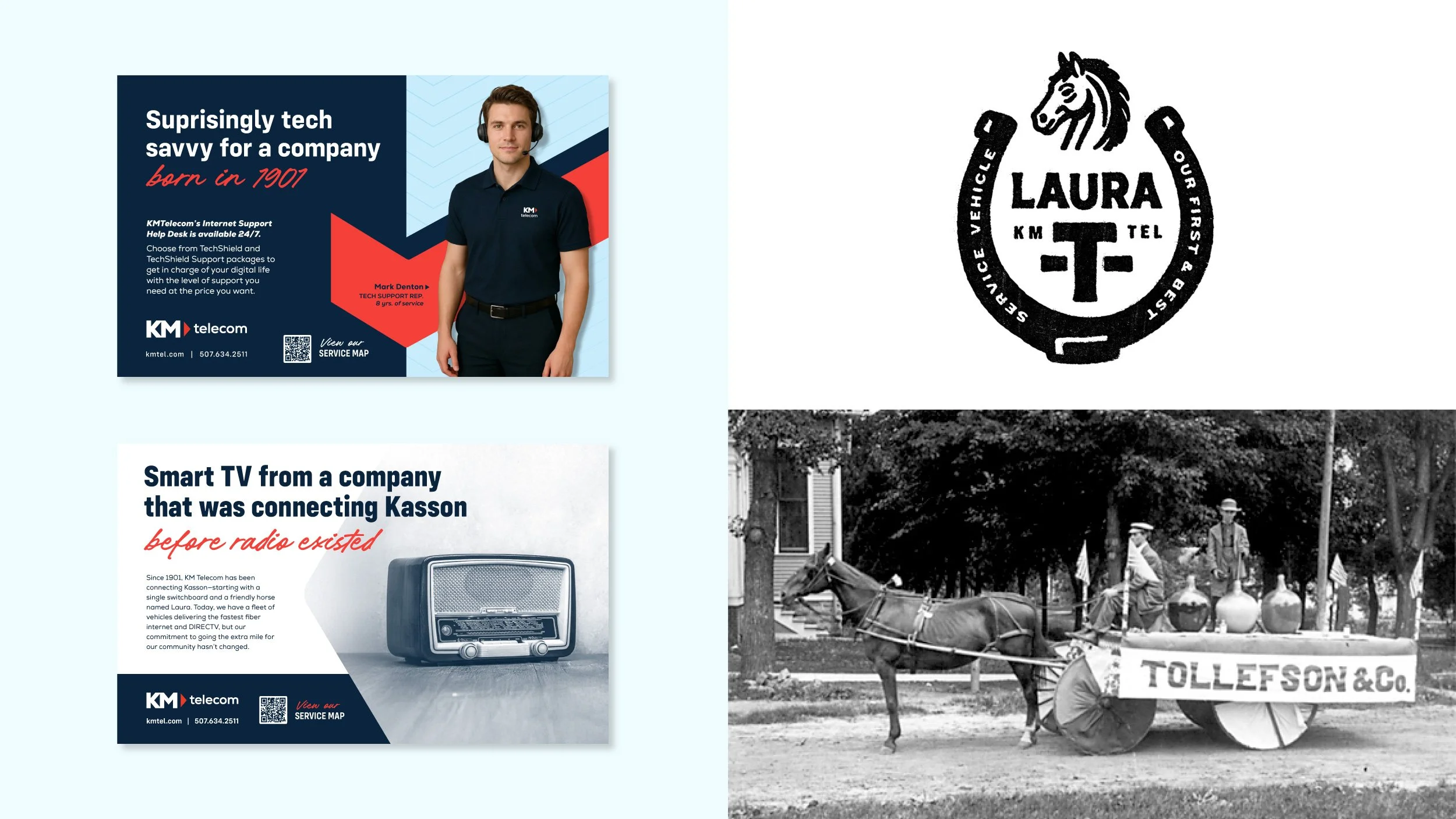
KM Telecom has been connecting Kasson, Minnesota since 1901, back when the service was a single switchboard. Now it sells fiber internet in rural Minnesota, where the competition is national and much newer. Being the oldest company in town cuts both ways. It proves the company will still be there in twenty years, but it can also make a fiber provider look like a relic.
The solution
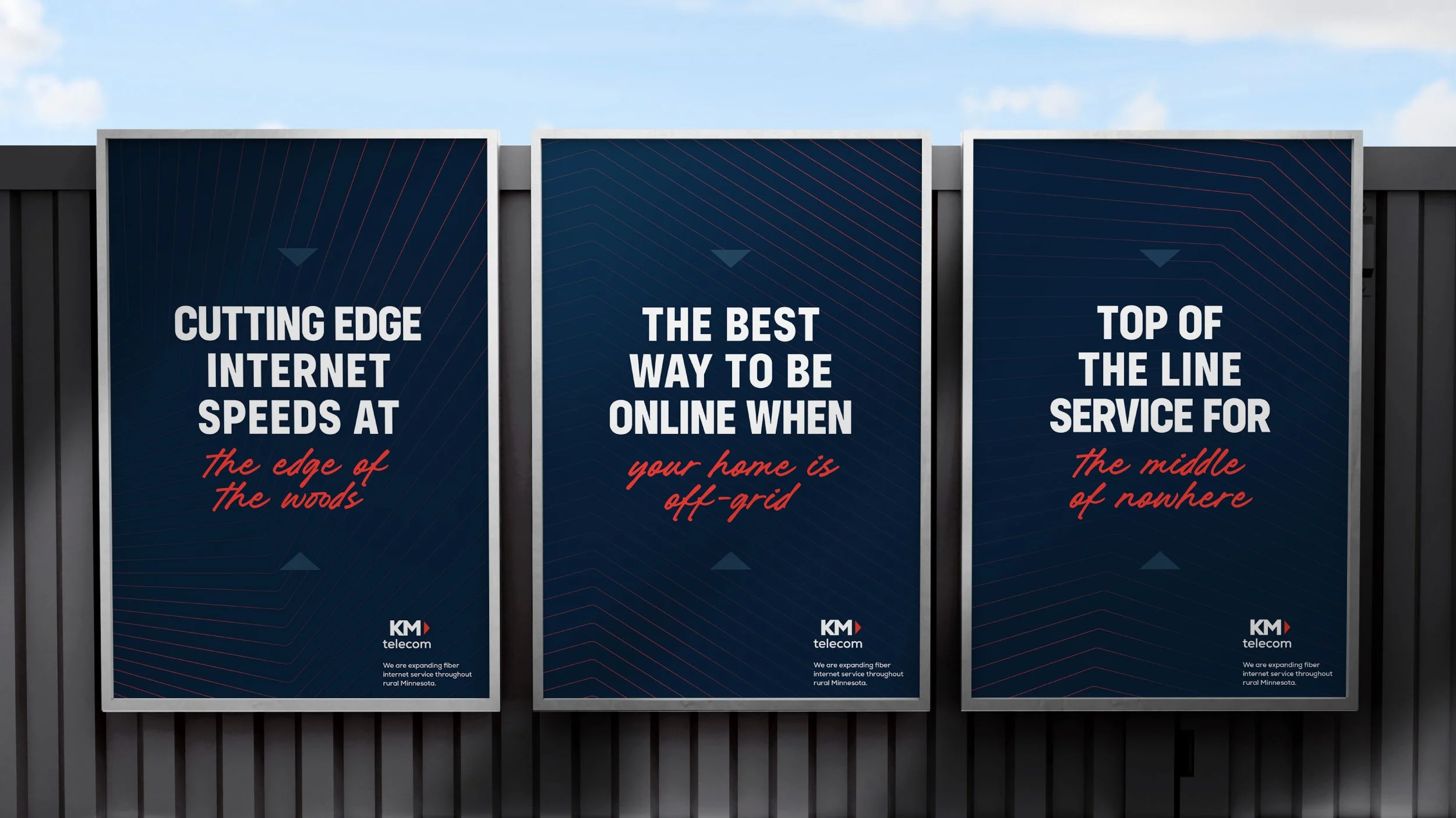
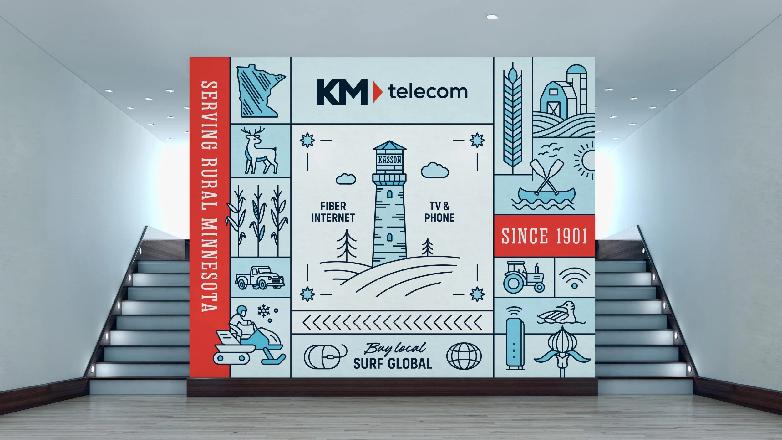
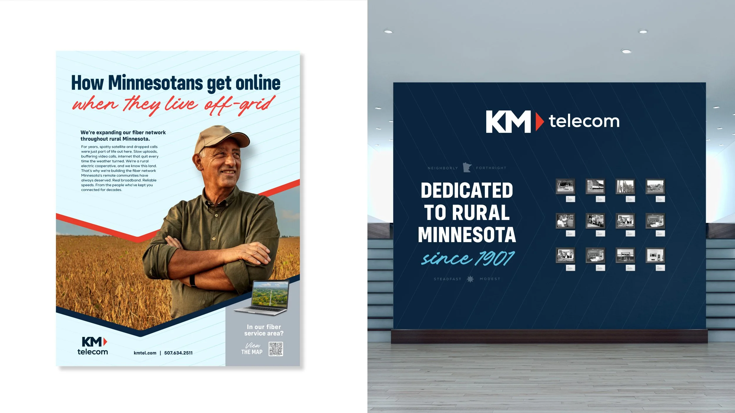
The logo pulls the triangle out of the negative space between the K and the M and repeats it as a forward-pointing arrow, so the mark carries both the company's initials and the direction the fiber is heading. Around it, a system that reads modern and clean but keeps one foot in the past through script lettering, print texture, and archival photography from the company's own history. The heritage stops being a liability and starts being the reason to trust them. I designed the identity and its applications.