The challenge
Pathway is a fiber internet provider serving rural Texas that national carriers never attempted to service. The name had been picked randomly, and the original logo illustrated it literally with a winding path. The logo was similar to the mark of a church a few miles up the road. The brand needed to stop being mistaken for a church, and the name needed a reason to exist.
The solution
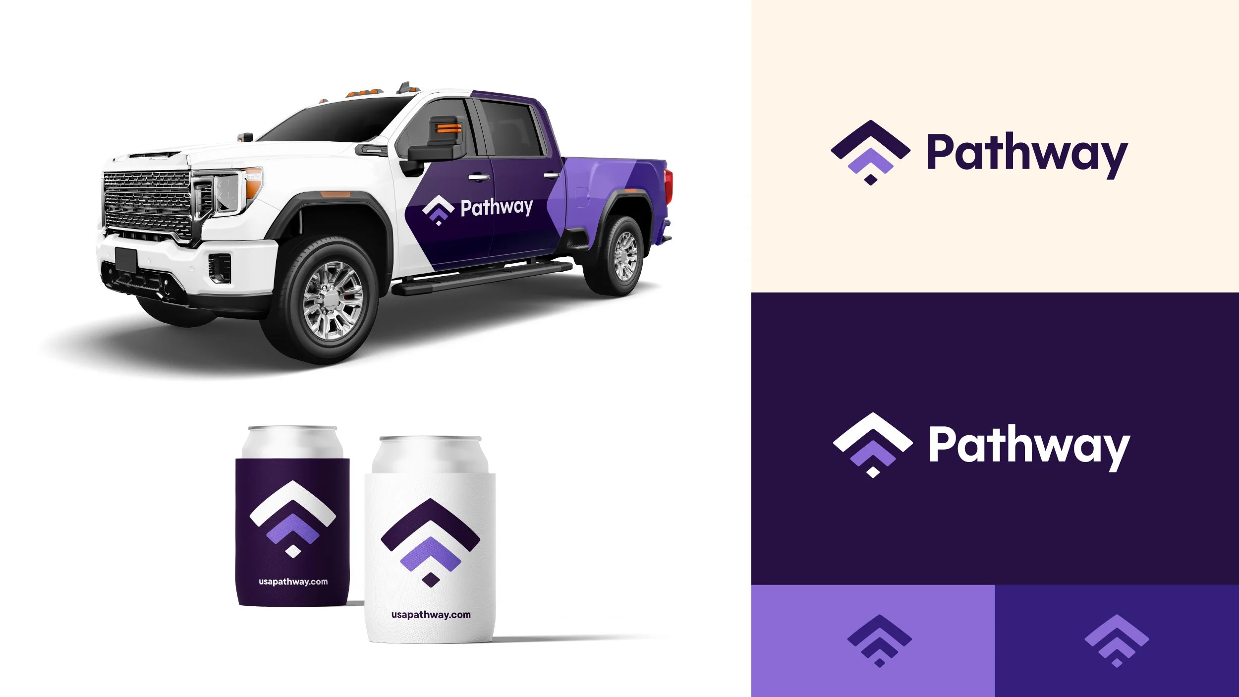
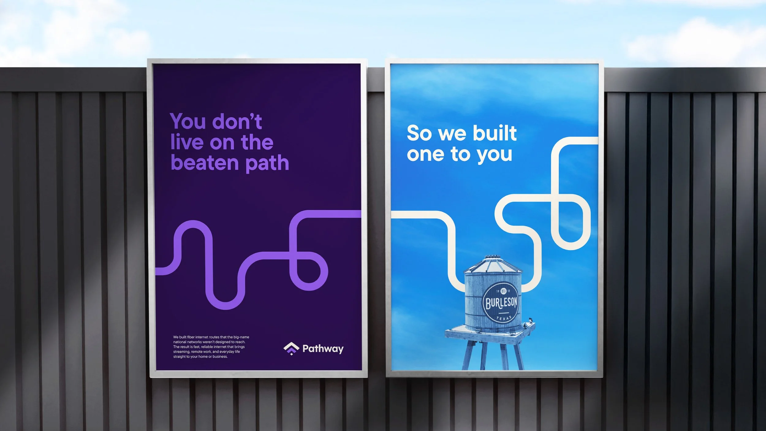
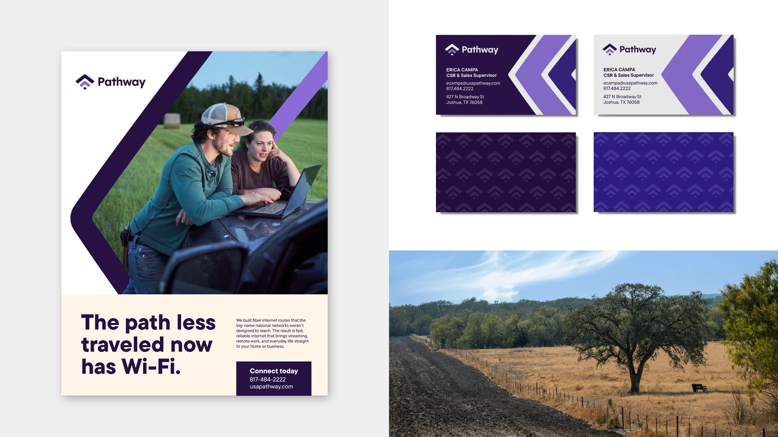
I gave the name a meaning by presenting it as the route the internet takes to get to subscribers. The mark stacks chevrons into a form that reads as both a Wi-Fi signal and an arrow moving forward, and the path returns as a graphic device that runs across the work. The copy makes the idea plain and reinforces the path graphics, which turned their arbitrary name into the whole campaign. I designed the identity and wrote the copy.