
The challenge
Don’t Stop Rockin’ (a music school for kids) had just been acquired by a new owner who wanted to shift from the “kid-friendly” look and feel of the brand into something that would match the students’ rock star aspirations and appeal to their Millenial and Gen X parents as well.
The solution
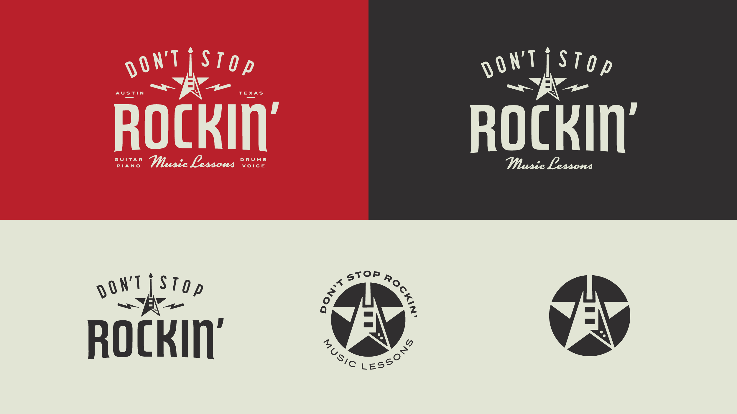
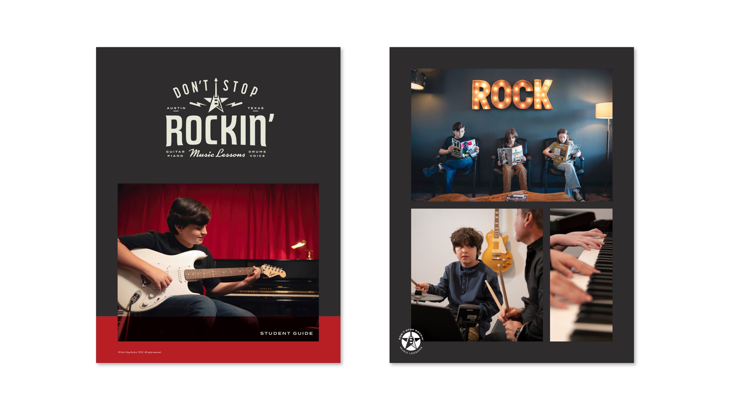
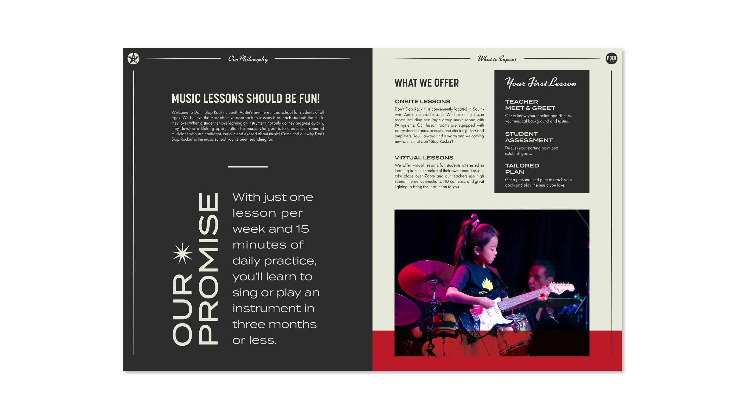
Rebrand the school around vintage rock iconography and typography. Make the guitar and star front and center in a retro badge and pair with condensed concert-poster-style lettering that signals traditional rock and roll. This visual language borrows directly from classic gig posters and Americana signage, giving the brand an instant "rock star" look instead of a "classroom" one. In addition to the graphic design, I also did two photo shoots with the students, one at the school and one with the students on-stage at their annual performance. This allowed the student guide and marketing materials to lead with authentic imagery that shows kids practicing in a pro studio and rocking out at a real downtown venue.
Previous
Previous
Pioneer | We're your neighbors
Next
Next